Brick houses have a lot of character and charm, but finding the correct brick and paint color combinations to go with them may be challenging. You’ll need to pick a paint color that complements the red brick without detracting from the home’s attractiveness. Follow along as we reveal the top 10 brick and paint color combinations.
We enjoy seeing what folks pick for their exterior paint colors and how they complement the home’s features. Recently, It is because they might be difficult to match paint colors with. Whether you’re building a home with brick as an accent or a home with brick throughout, you’ll want to be sure that exterior brick and paint color combinations complement each other.
In this article, we would like to discuss 10 brick and paint color combinations that go well with the exterior.
How to Choose Exterior Brick And Paint Color Combinations
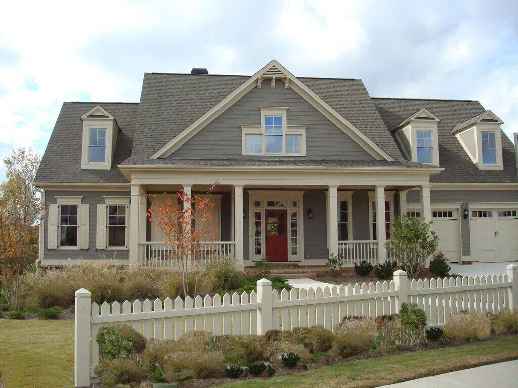
What color goes well with red brick and paint color combinations? Is it necessary to select a neutral paint color? It is a common thought when it comes to brick exteriors, there are a few options for selecting a paint color to complement it.
For starters, we know that red brick is more subdued and subdued. As a result, we’ll need to keep that in mind while choosing paint colors to complement it. If you’re going to use white, for example, go for a creamy white rather than a brilliant white. When paired with brick, the dazzling white might look a touch too harsh. An off-white will seem white against the brick, but it will be softer.
Second, we want the paint colors to complement rather than contrast with the brick. One method to achieve this is to use colors that come from the brick itself. Redbrick, on the whole, comes in a variety of hues. Choosing one of those color choices will help maintain the house’s appearance together.
10 Brick and Paint Color Combinations
1. Benjamin Moore’s Seapearl and Simply White
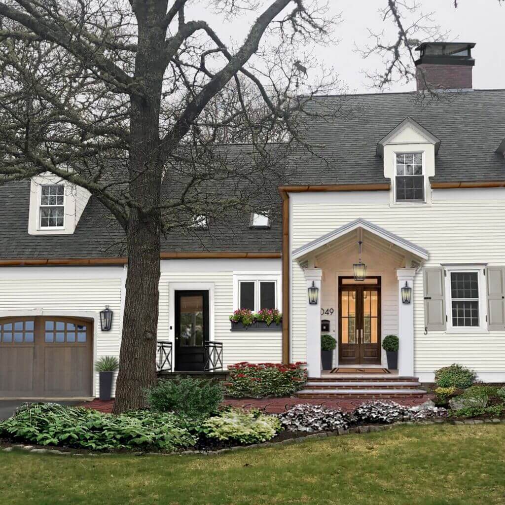
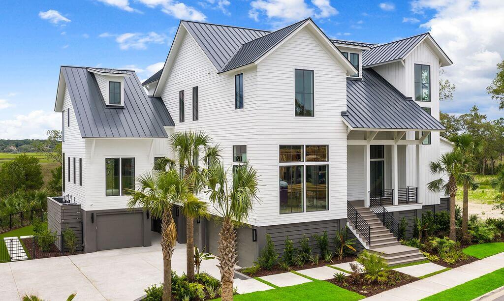
One of the favorite brick and paint color combinations are white paints are these Benjamin Moore classics. Seapearl is off-white with an LRV of 77.95. The LRV of Simply White is 91.7, making it significantly brighter. While these hues are similar and form a monochromatic color scheme, their undertones slightly differ. Simply White has a warm glow that draws attention to and contrasts with the gray undertones of Seapearl.
2. Sherwin Williams Alabaster with Tricorn Black

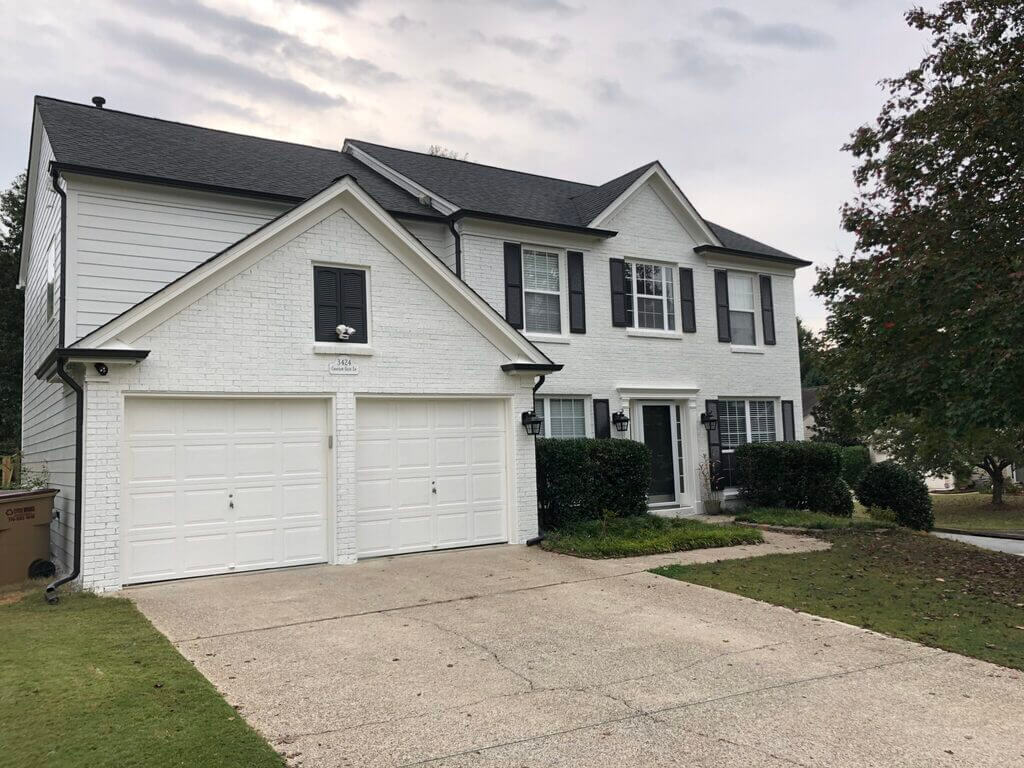
Sherwin Williams’ Alabaster is a fantastic exterior brick color idea. Because this paint hue reads differently on different textures, it’s an excellent choice for a range of exterior housing materials. When pursuing this approach, we recommend using accents in a darker paint, such as Sherwin Williams’ Tricorn Black, to enhance dimension and depth.
It isn’t a harsh black-and-white checkerboard-style combination since Alabaster isn’t a stark white and Tricorn Black isn’t a stark black. This contemporary brick and paint color combination have a subtle drama.
3. Benjamin Moore’s Olympic Mountains Brick and Paint Color Combination
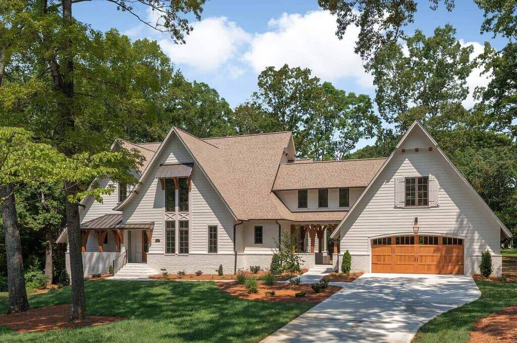
The home’s facade is brought together by this warm, earthy brick and paint color mix. Instead of being a point of contrast, these paint hues work well together. On the brick, Olympic Mountains take center stage, Sandy Hook Gray adorns the soffits and fascia, and Simply White highlights the trim.
4. Exterior Paint Color Combination with Benjamin Moore’s Grant Beige
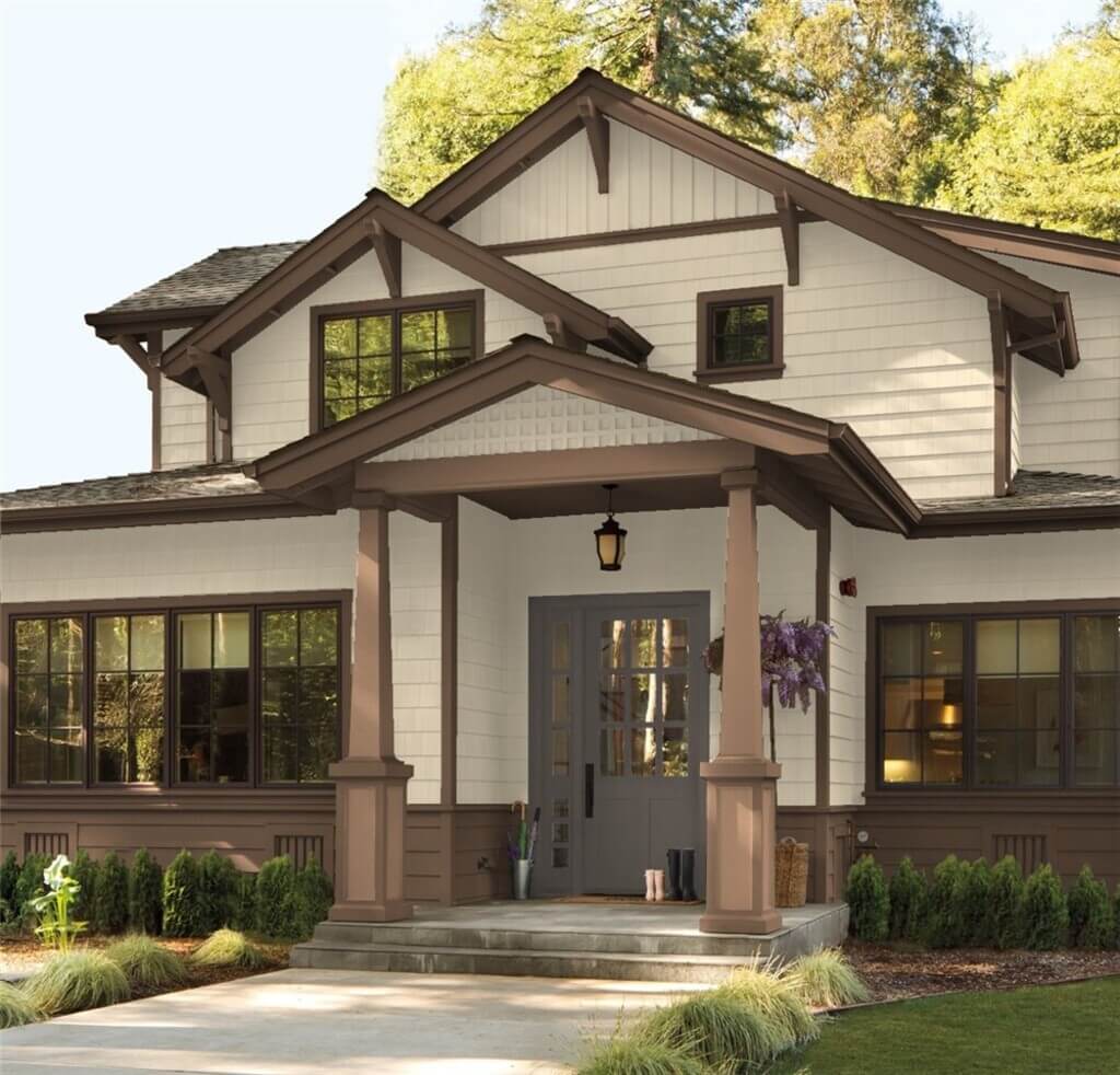
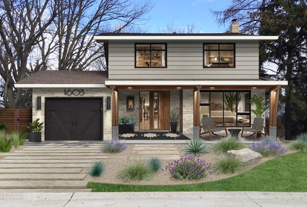
When the brick is painted beige or off-white, it looks fresh and modern with orange clay tile roofs. Redbrick can’t compete with such a distinctive roof as the focal point of an external design. Benjamin Moore’s Grant Beige is a go-to beige for many designers.
In this example, the accents in Sherwin Williams’ Urbane Bronze give depth and bridge the gap between the softer beige and the rich roof tile hue. With a clay tile roof and beige paint, bronze or copper gutters and downspouts look fantastic.
5. Benjamin Moore Iron Mountain and Sherwin Williams Natural Choice
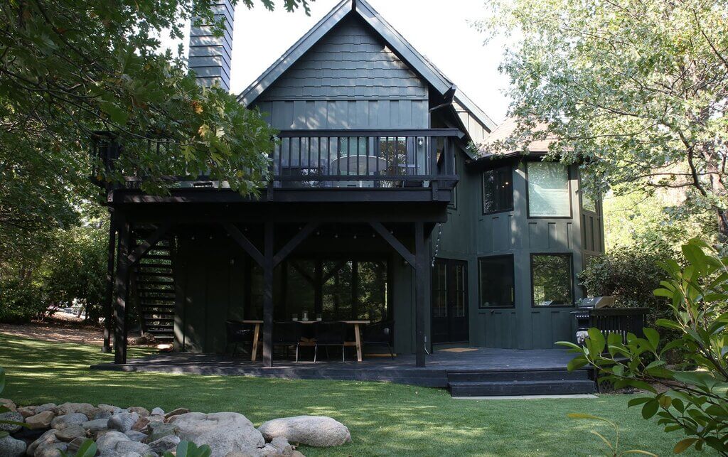
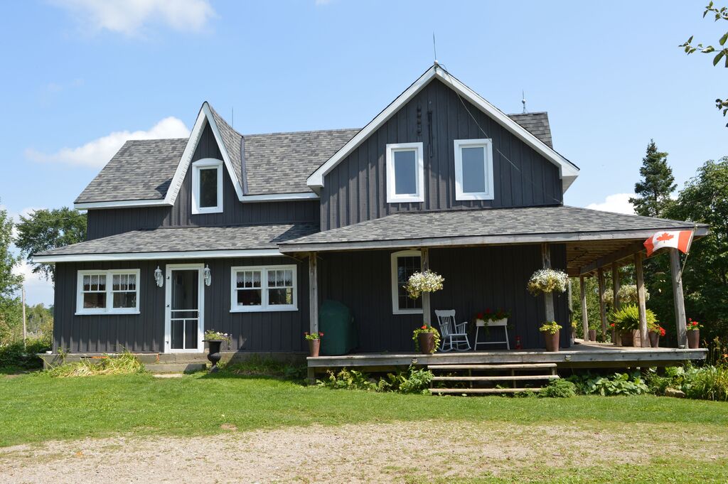
If you’re working with brick that hasn’t been painted before, you can use a limewash. This wonderful result gives a property an aged, ancient sense, with glimpses of brick still visible. Warm undertone paints go well with the warm brick that shows through. And there are so many lovely architectural details to highlight with color on this property.
The designer suggested accents painted in Benjamin Moore’s Iron Mountain and Sherwin Williams’ Natural Choice and Porpoise.
6. Benjamin Moore’s Sea Pearl and Onyx and Sherwin Williams’ Iron Ore

Both kinds function admirably when painted on properly prepared brick. Because the front-facing bricks seem off-white and the cracks between the bricks appear gray, Seapearl looks particularly attractive on brick. Painting all of the non-brick sidings in Sherwin Williams’ Iron Ore and the trim and accents in Benjamin Moore’s Onyx creates a rich, deep contrast that brings out Seapearl’s gray undertones.
7. Benjamin Moore’s Natural Red Brick with Sandy Hook Gray
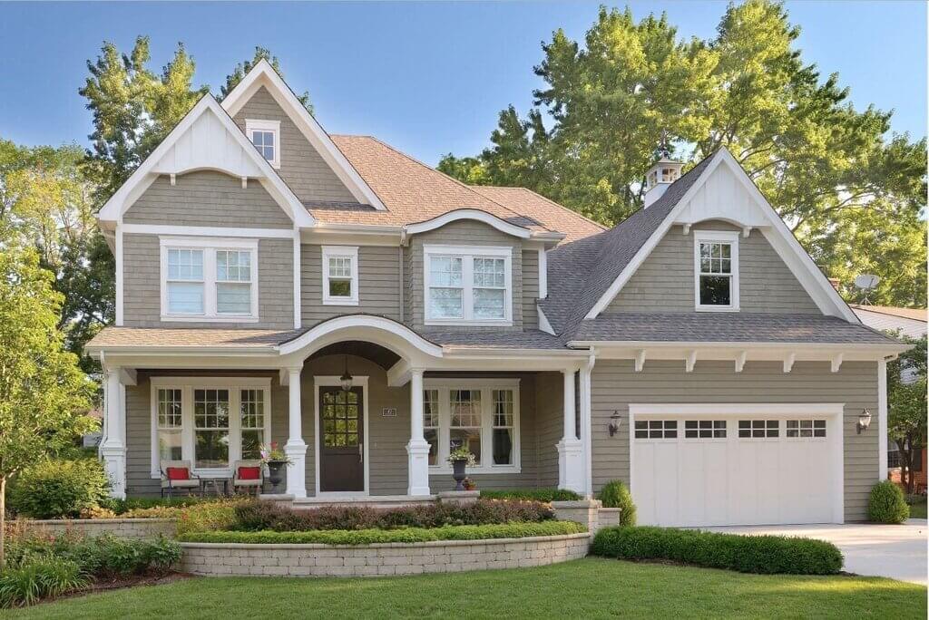
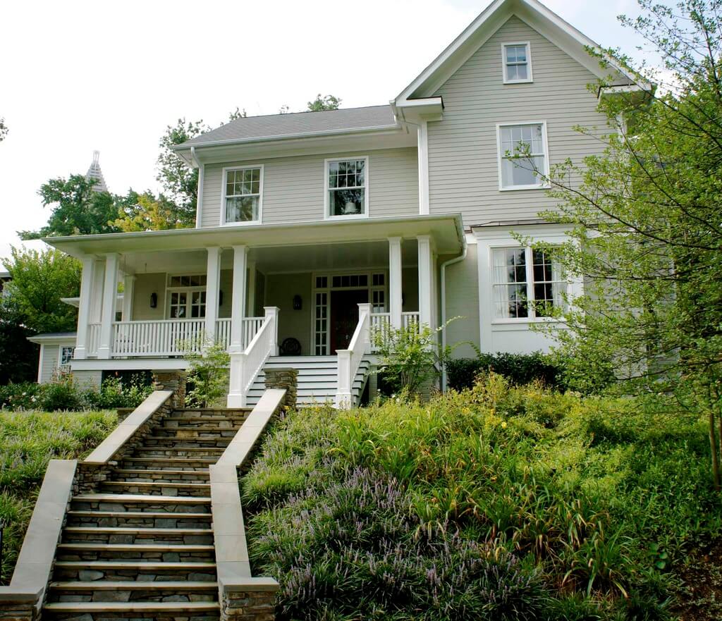
If you want to maintain your red brick looking natural, greige trim can help. In our opinion, it’s one of the greatest brick and paint color combinations. In truth, many bricks include natural flecks of gray and beige stone, and mortar frequently seems greige from afar. Benjamin Moore’s Sandy Hook Gray will bring out these tones in your trim.
8. Benjamin Moore’s Revere Pewter, Iron Mountain, and Onyx
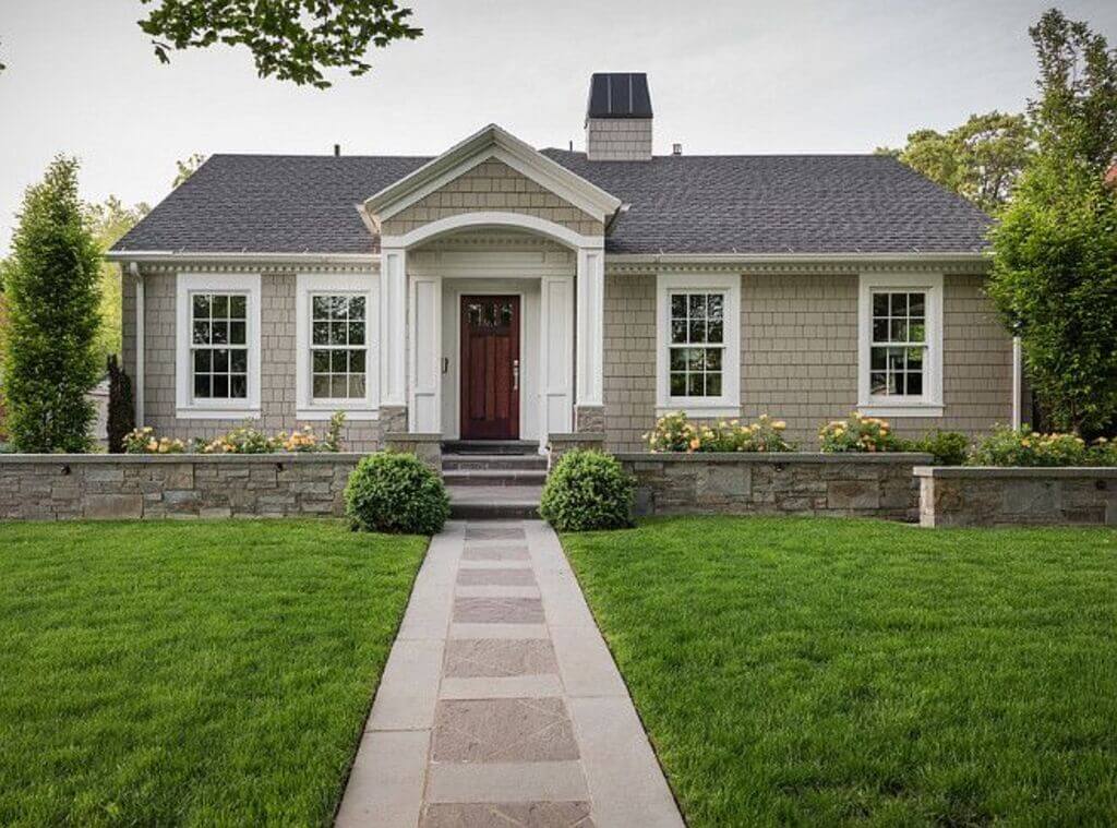
Mixed materials, with a little paint, become partners rather than rivals. This modern house design features a brick extension, shaker siding, and natural stone—all lovely elements in and of themselves, but the color scheme was a little overbearing. The appropriate brick and paint color combinations might make all the difference in this circumstance.
Iron Mountain on the shaker siding adds depth to the house and brings out the grays and blues in the stone. The onyx paint on the shutter adds a splash of color.
9. Benjamin Moore Natural Red Brick with Revere Pewter, Iron Mountain, and Onyx
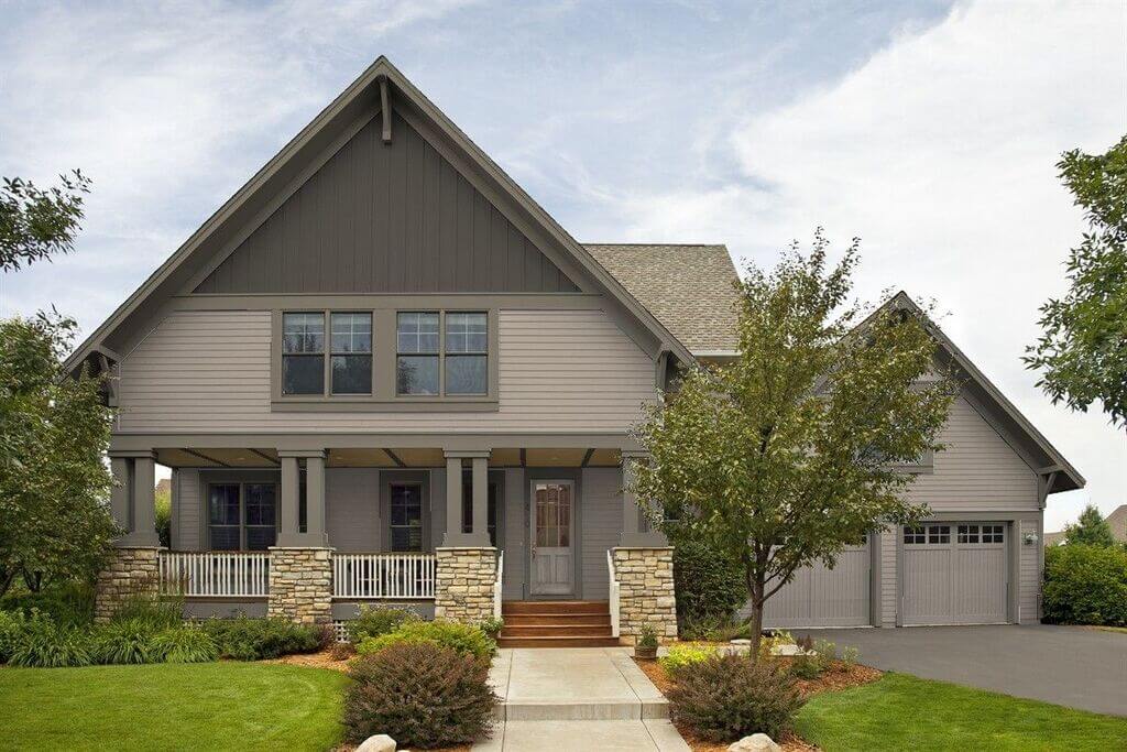
It appears completely different when coupled with bare brick. Revere Pewter, Iron Mountain, and Onyx are three complementary neutrals. Even with a high-contrast red brick and light mortar foundation, these paint colors help identify a home’s architectural characteristics without feeling overly cluttered.
10. Sherwin Williams Alabaster and Natural Wood
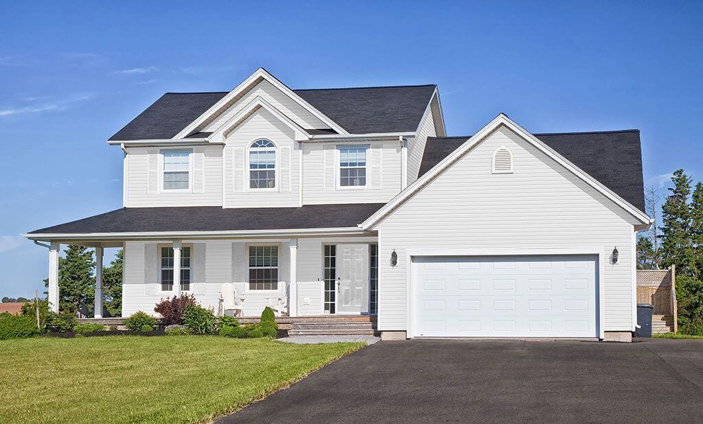
Limewash or pale brick isn’t for everyone. Alabaster is an excellent alternative to modernize your brick with a new white. It complements natural wood thanks to its warm beige undertones. This combination, together with the black-trim Marvin windows, drastically transforms the appearance of this property.
Tips and Tricks: Brick and Paint Color Combinations
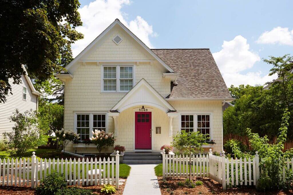
- Brick will keep your whites creamy. Consider SW Alabaster, a warm white, or SW Shoji White, a light greige. Outside, it will seem white. A crisp or pristine white would appear harsh.
- Outside, paint colors appear 5-10 times brighter and more vibrant than inside. A gray hue might appear blue, green, or violet, depending on the undertones. One of the most common mistakes homeowners make is selecting an exterior paint color too light.
- Consider matching the siding to the grout color. The majority of grout is a green-gray color. However, taupe grout is occasionally seen.
- Surfaces that have a rough texture, such as stucco, appear darker. If a house’s siding and stucco are painted the same color, the plaster will seem darker.
- Consider utilizing a white trim color if you have white vinyl windows. The vinyl windows will seem less stark with a white trim color.
- To help your paint last longer, get the greatest quality paint you can afford. Dark colors fade faster than light colors, although this is less of an issue if you choose high-quality paint. The better the paint, the longer the warranty.
- Because brick has an earthy appearance, choose a subdued paint color. Whites should be creamy or light grays with a subtle undertone. Exterior paint colors will appear five to ten times brighter and more vibrant in the sun.
FAQs:
Take a look at the alternatives in this article for some inspiration if you need help picking exterior paint color combinations for your home. You should also choose colors depending on the climate in your area and colors that best represent your individuality.
In 2022, What Are the Most Popular Exterior House Colors?
A mix of yellow and gray is the color of the year, and it’s the best choice for both exteriors and interiors. We can see how gray has quickly become a popular choice for homes with contemporary exteriors.
When choosing more than one color for your exteriors, it’s a good idea to use colors that contrast and complement one another. You can use any exterior color combinations described in this article, or you can talk with a painting professional who will advise you on the perfect colors for your property.
According to all painting and design experts, You should avoid black and other dark colors. These colors absorb more dust, necessitating more regular wall repainting. You can blend a light shade of the dark color with another light color.
When selecting paint colors for the exterior of your home, consider the environment and where you will be residing. Choose darker colors in colder areas and vice versa. Examine the colors in your neighborhood to choose if you want to fit in or stick out.
In case you missed it!

