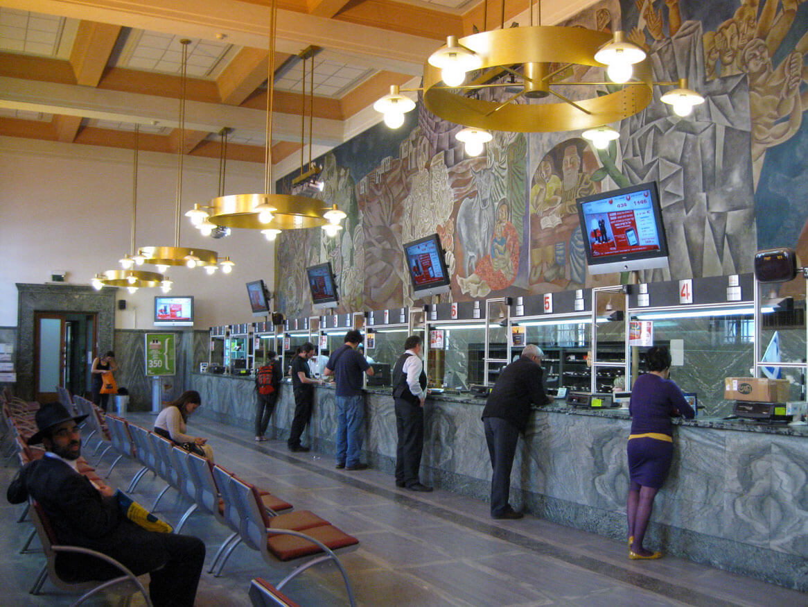
The 21st century is all about digital technology. It has its impact in each and every field. Banks are no exception. Digital banking and its profit have badly affected traditional banking. Many surveys clearly indicate how online banking is being preferred by customers every time. Thus, bankers have started changing the way banks look and work, just like shopping malls and complexes do. Earlier, white-washed walls, boring furniture pieces, and heaps of documents and stationeries defined banks. However, the scenario of modern bank interior design has completely changed since then.
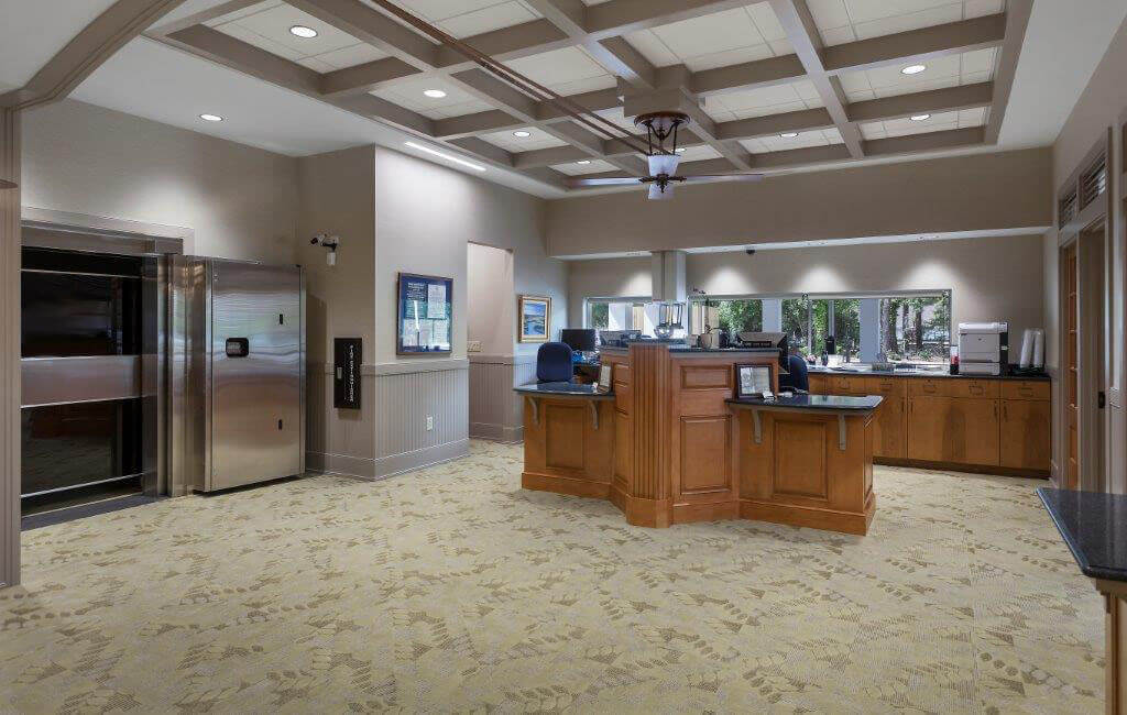
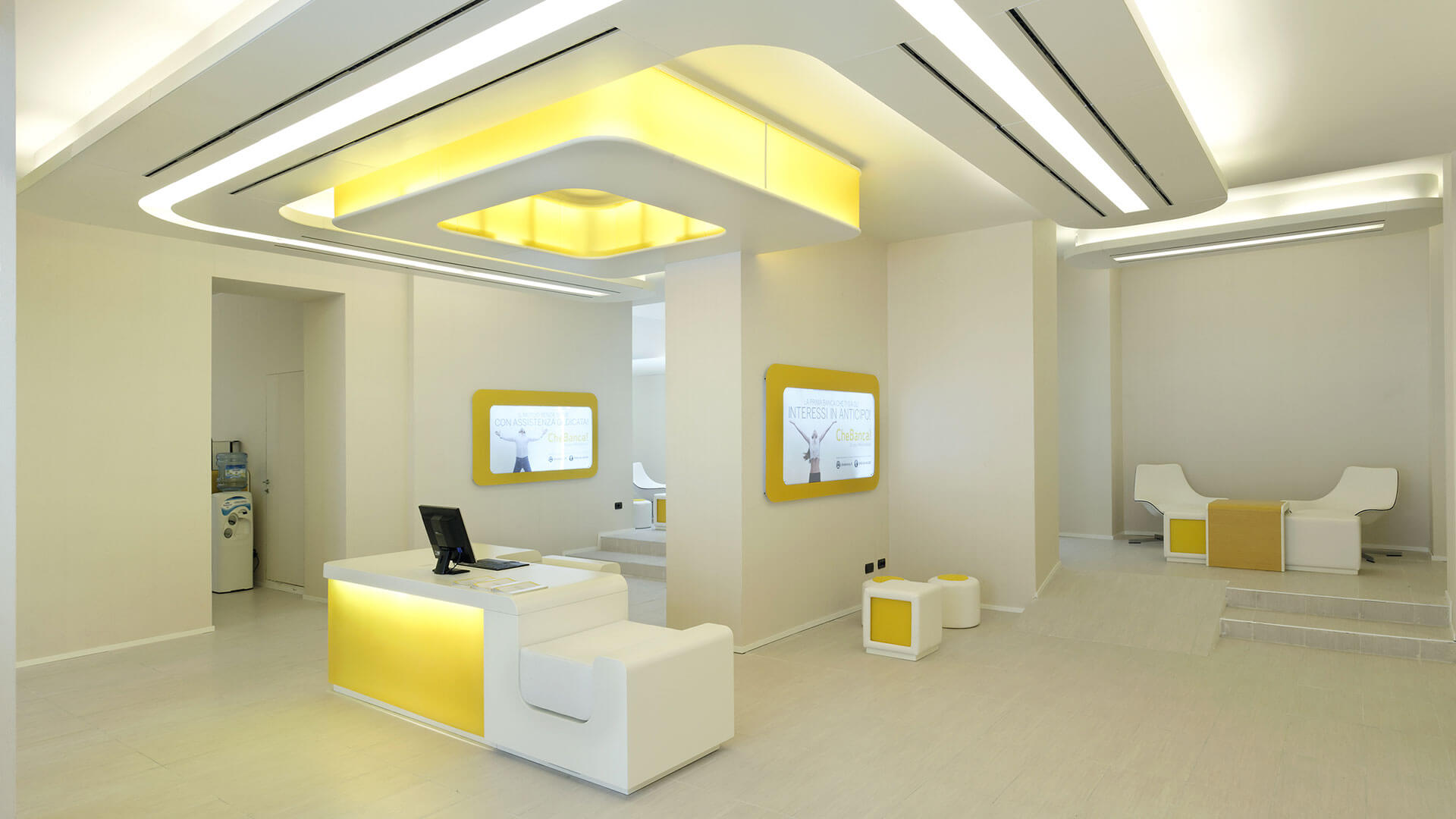
Nowadays, most of the traditional banking works are done on laptops and PCs instead of pen and paper. Modern banks are using warm welcoming designs and open layout which makes the experience worth remembering. There are no more brochures at the counters for new customers or compact rooms for important meetings because smart digital tools are used to accomplish these banking works.
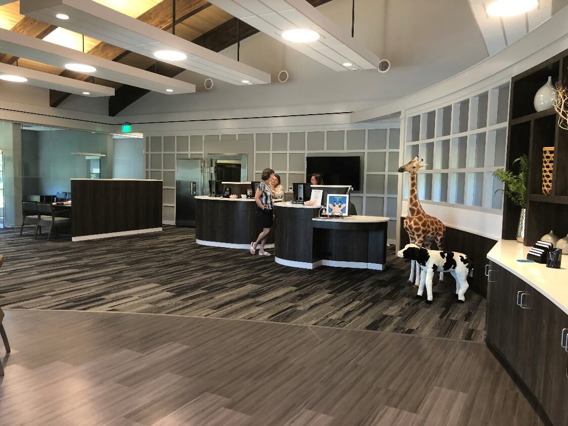
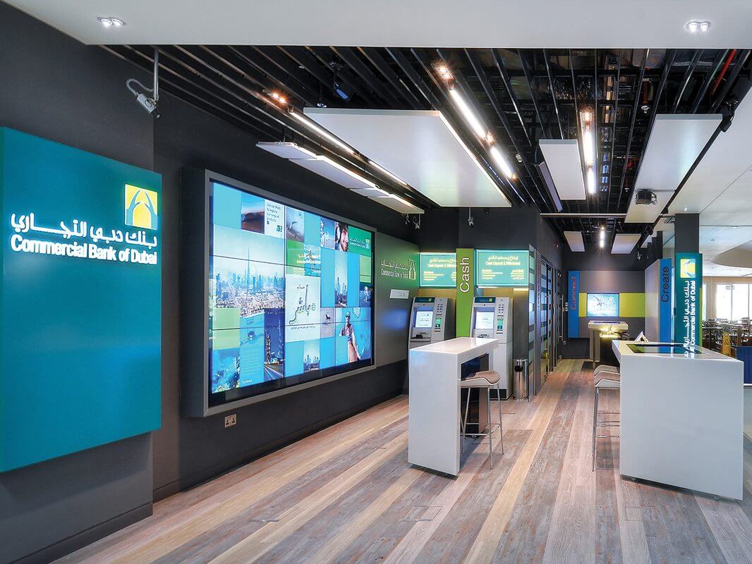
Seeing huge box-like monitors and papers all around creates an extremely bad impression of the bank. But when the customers walk into a modern bank, a classy video wall greets them. The video walls have halo lights around the edges that change colors with respect to the content shown on the screen. This is an example of how architecture can help in giving a better customer experience. Such designs are liked by people because of the simplicity and elimination of friction. There is no delay because the work is done in a fraction of seconds. In the near future, authorities are expected to provide simpler and better offers using digital solutions.
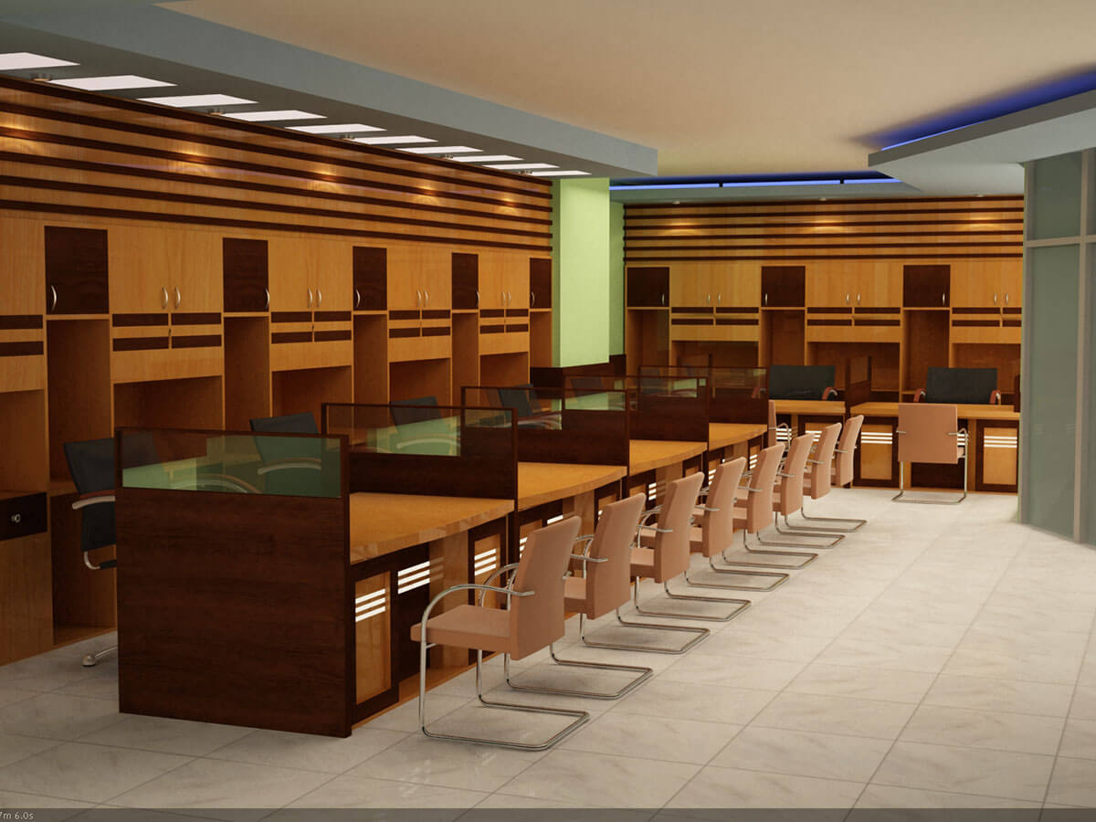
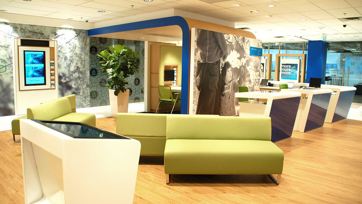
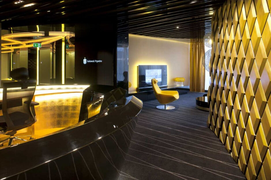
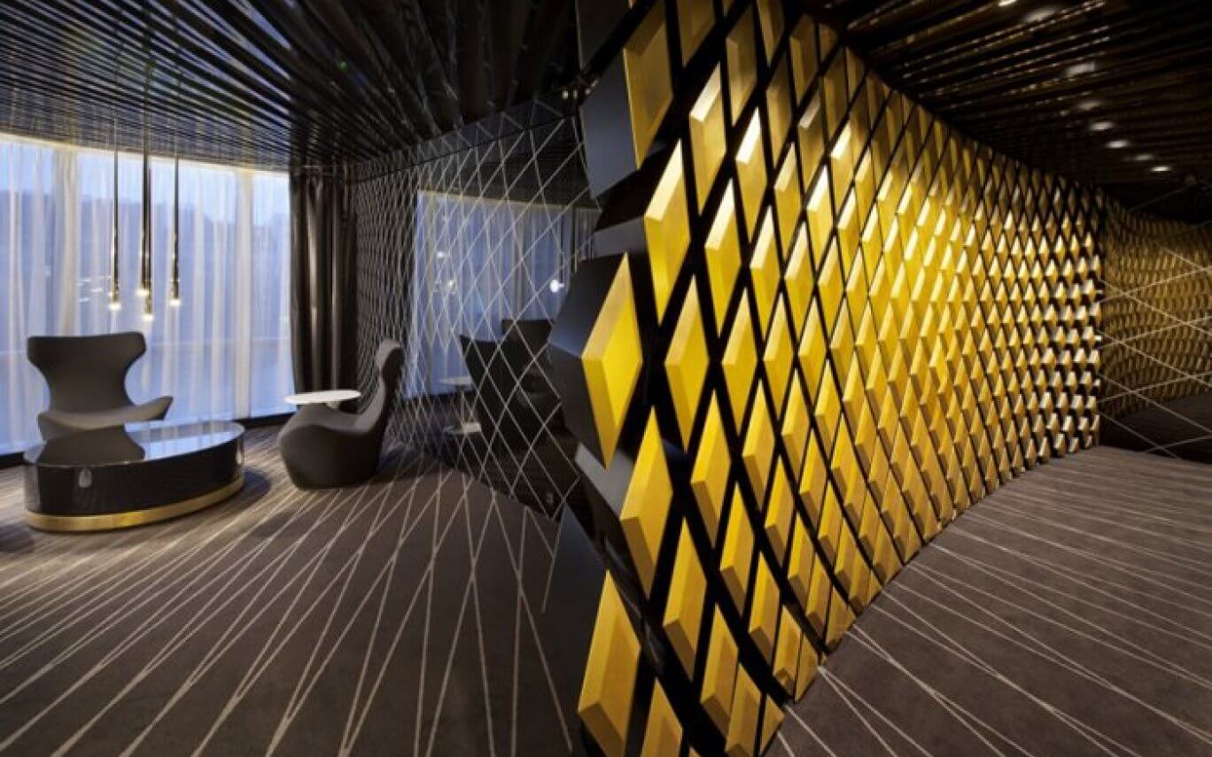
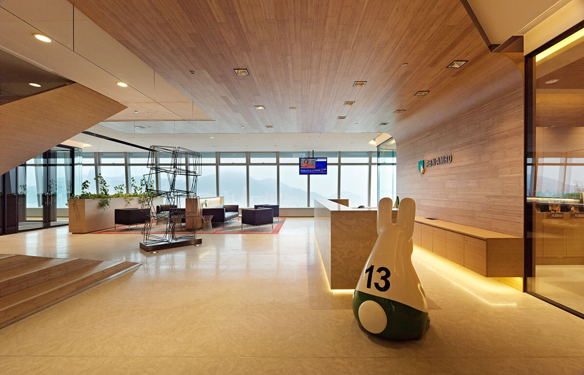
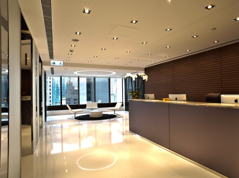
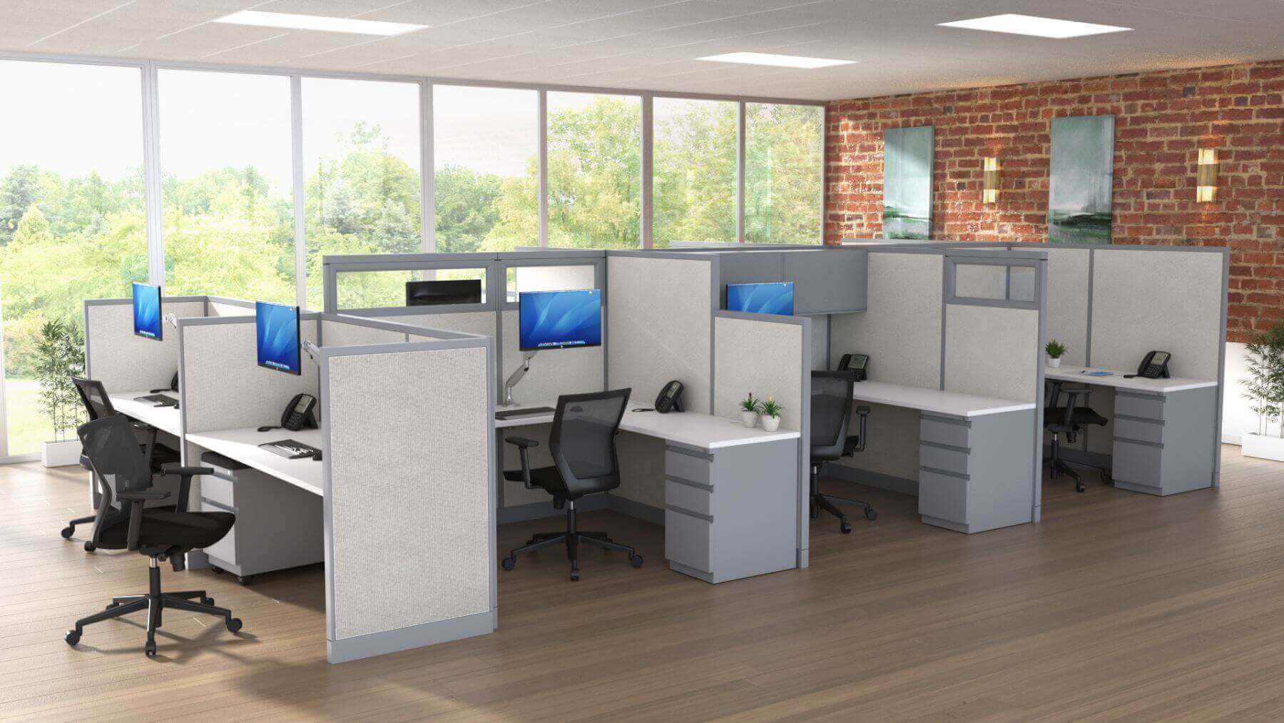
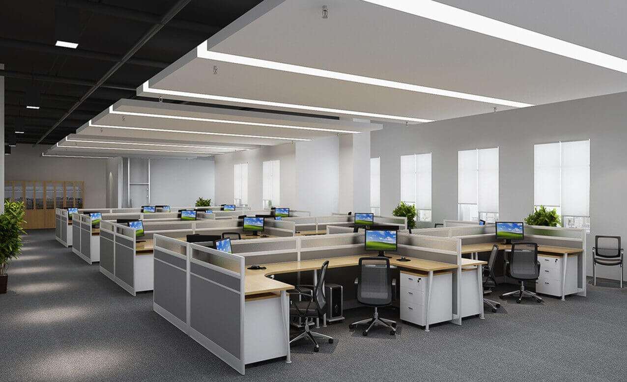
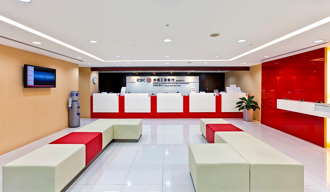
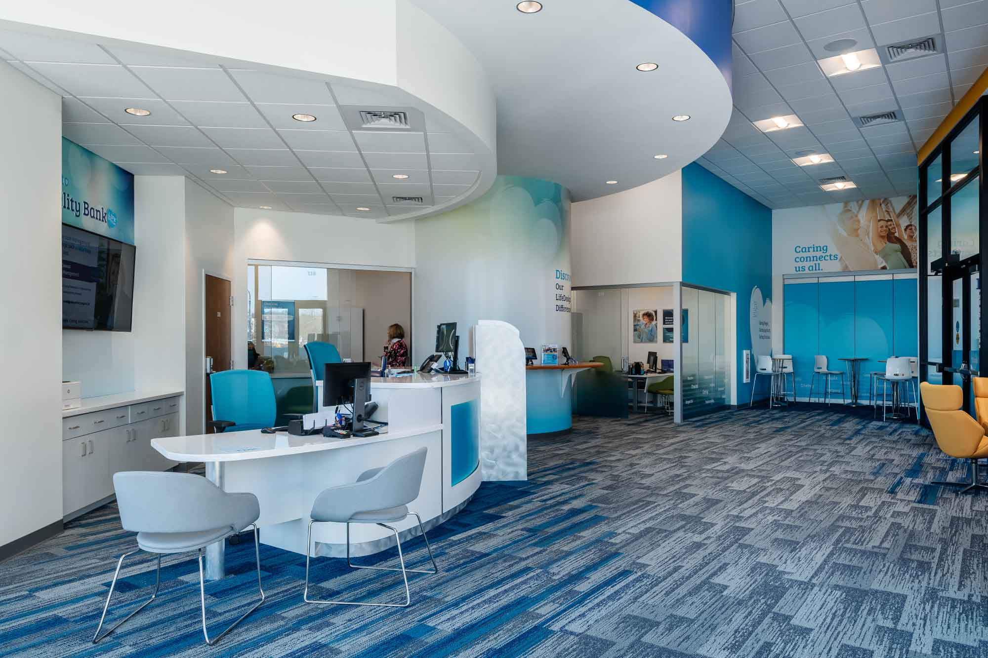
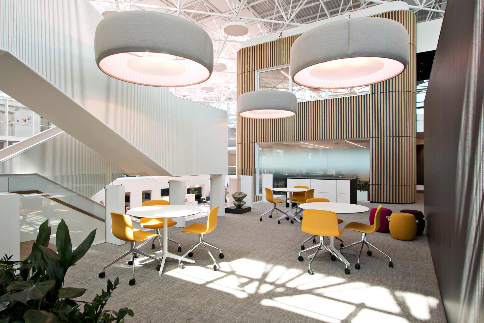
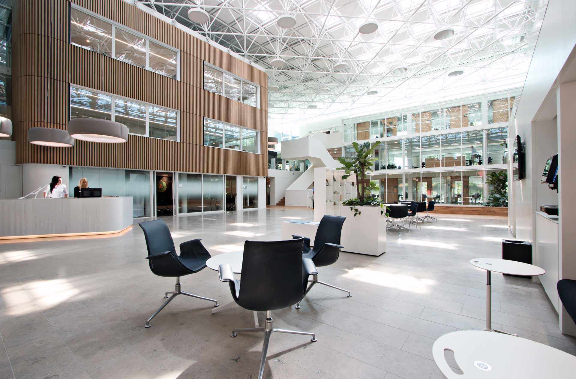
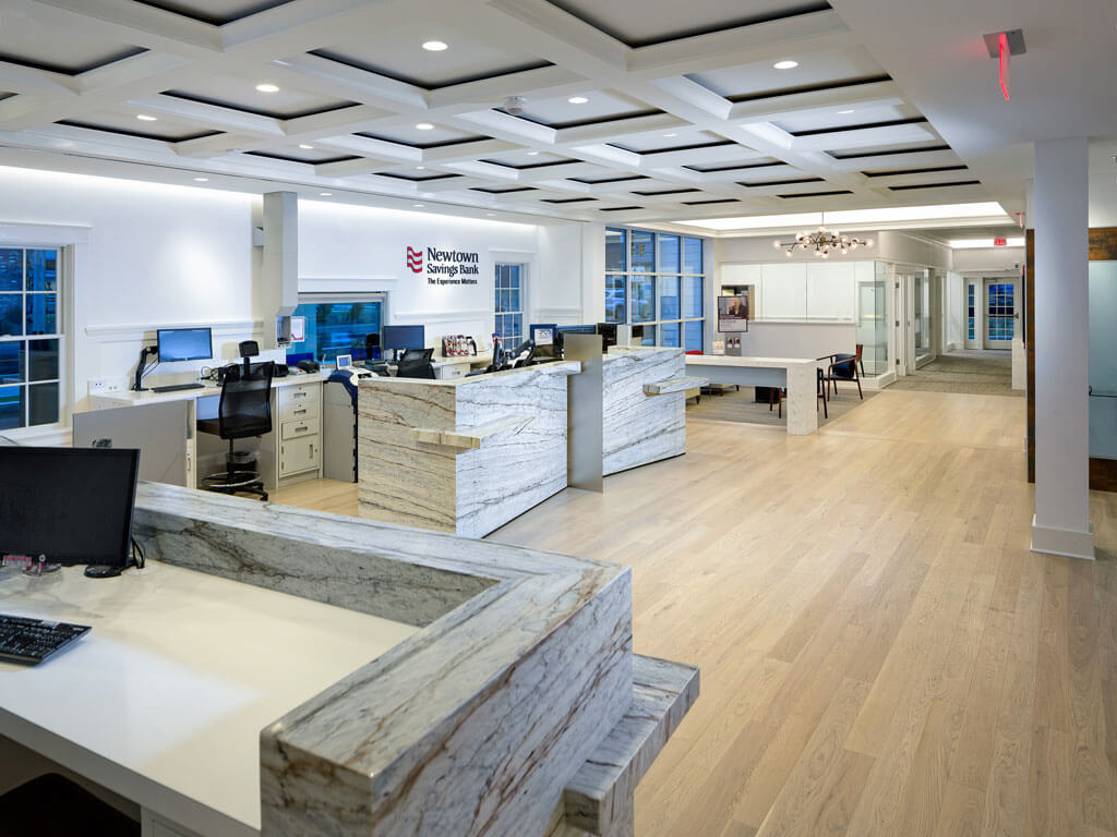
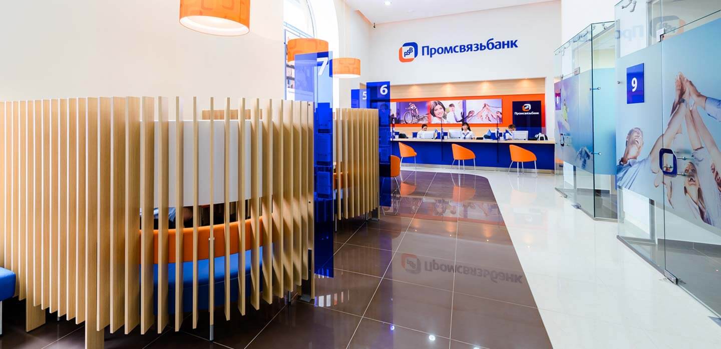
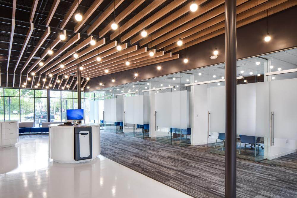
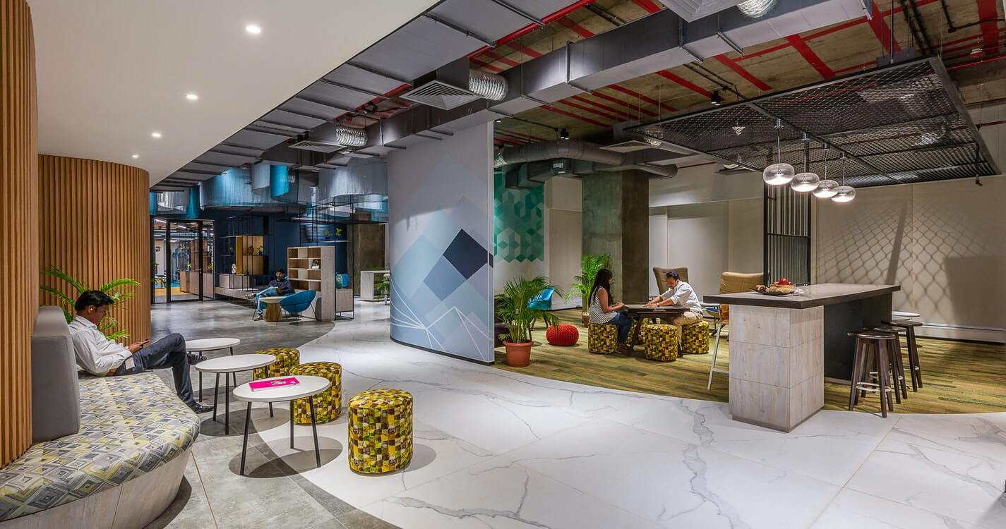
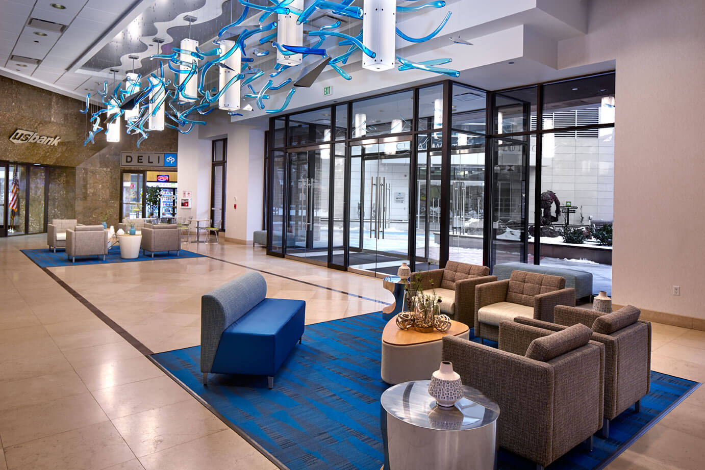
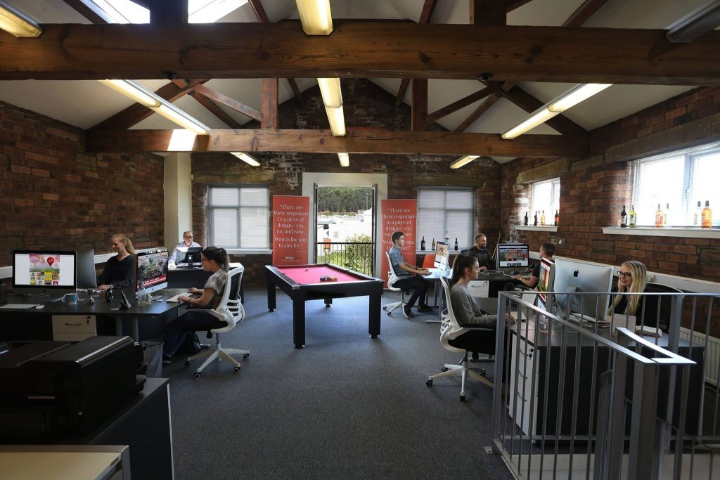
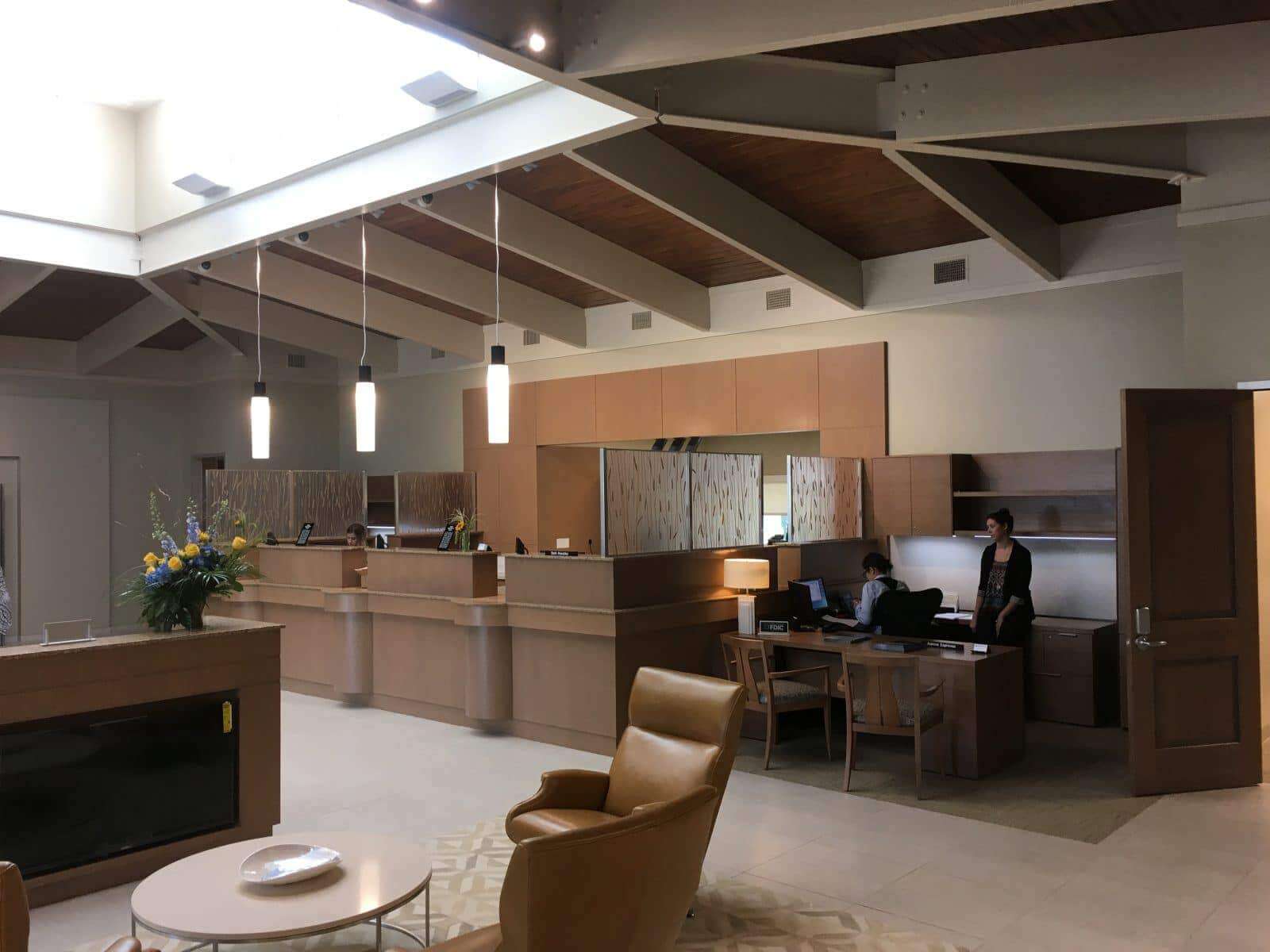
No matter how difficult it is to convert everything into digital channels, banks are busy redesigning their branches and installing new technologies in them. They are looking for new and creative ways to use the limited space to offer the best experience to their customers. For more bank interior design ideas, you can go through the pictures given below.
Read more:–

