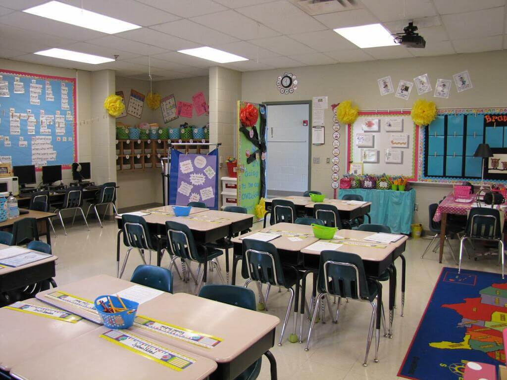
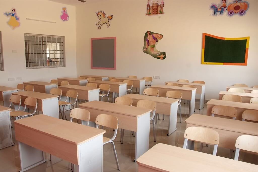
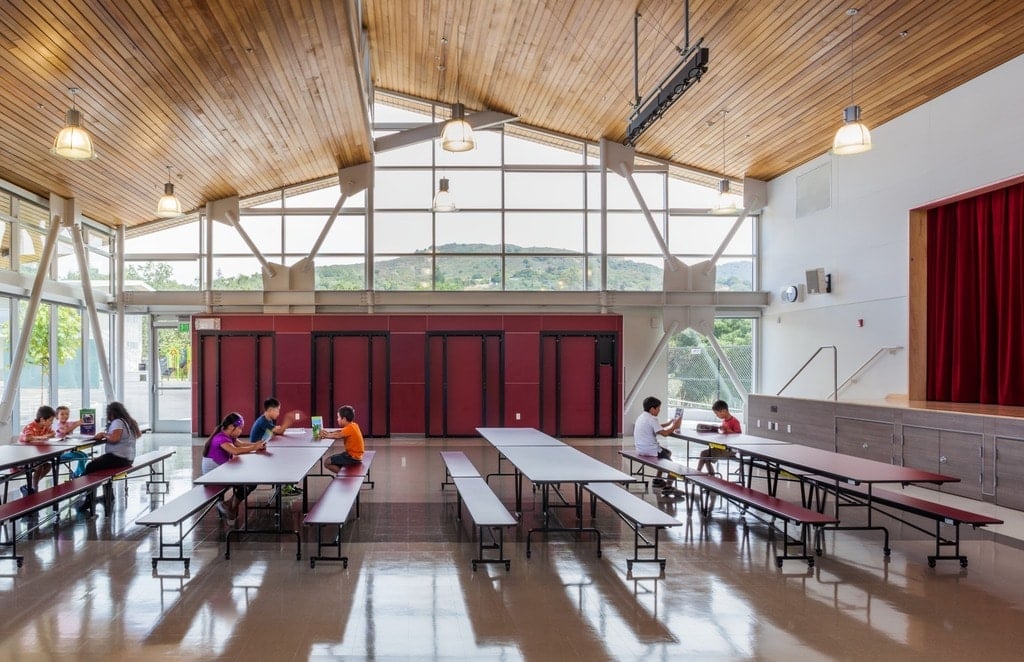
When it comes to designing a school, college, or university, there are a lot of different things to consider. You’re not just creating a teaching environment but also a facility that fosters learning and education. While we may not realize it, the area around us can play a big part in our productivity. In this article, we are going to take a look at eight school and college design tips that you should follow if you are developing a new establishment.
Let’s get started!
Utilize Functional Furniture Around the Campus

Schools can be highly populated areas, so when choosing furniture for classrooms and common areas, you want pieces that are versatile and long-lasting. Otherwise, you’re going to be replacing things a lot sooner than you would like. Options like this School Dining Furniture at Seatable UK are an excellent choice for both indoor and outdoor areas. The better the quality, the longer things will last, so make sure you consider that!
Be Smart with Your Lighting Choices

When it comes to choosing your lighting options for areas of a school or college, you want to include a selection of both natural and LED lighting. Believe it or not, the color of certain lights can have different effects on our mood. Studies have shown that blue-enriched white light stimulates the brain, improving efficiency and alertness. While natural light helps boost our Vitamin D and can ward off seasonal depression. It’s a simple thing that can play a big part in productivity.
Take Advantage of Natural Displays
Having a good amount of greenery and natural resources in a school is also a great tip for designers. Not only does it help create a peaceful and relaxing atmosphere, but some studies have shown that students that spend more time around plants learn better. While indoor plants a great, it’s also a good idea to fill the landscape with trees and shrubs for added shade. This creates a relaxing space while contributing to our environment.
Use a Range of Diverse Art Pieces

Art is a great way to inspire students, and filling the walls with unique and diverse pieces can be an excellent way to pull a room together. You may even consider finding some local artists to create beautiful murals. Check out these impressive modern school and university designs if you need some inspiration!
Think Like a Young Adult
When designing a space that is going to be utilized for young adults, you want to try and take a step in their shoes. While it may be easier to stick with more simplistic designs, branching out can make a big difference. Utilizing different colors and prints can bring a youthfulness to an area that instantly makes it appear more fun. Remember, the goal here is to encourage learning, and creating something that seems too clinical can impact that.
Prepare Your Layout with Practicality in Mind

Classrooms and common areas in schools require a bit more planning than other commercial spaces. While it’s important to make the area look its best, you also need to consider its practicality. Desks need to be appropriately spaced; teachers need to be able to access certain areas easily, and there needs to be enough seating for students in between lessons. To assist with this, try assessing the number of students that will be present so that areas aren’t crowded.
Develop Social and Independent Areas

While you might be caught up in developing social areas that encourage friendships and communication, it’s also important to have spaces for independent learners. Quiet study rooms or book nooks can allow individuals to think and work in in-between classes, without the distractions of heavily crowded areas. This balance helps students choose where they want to be while still allowing them the opportunity to relax. A ‘No talking’ room can be a great option.
Don’t Forget to Include Plenty of Signage
One of the most important that shouldn’t be forgotten for both schools and colleges is to include plenty of signage. You’re going to have new students, teachers, and visitors that will need to find their way around, and it can be extremely complicated if it is a large property. Signs should be clear and informative of all the necessary classrooms and facilities. Just remember not to overdo it! Too many signs can make things confusing.
And that’s it! These were eight college and school design tips that you should follow. What do you think? Is there anything else you would add to this list?
Discover more:

