The use of color is linked to the way people are feeling in the world at large. We are searching for opportunities to do something radically different as we explore a new future. Colors that highlight our drive to push the limits to fulfill our deep need for the joyful creativity and unlimited visual expression we crave as we enter this new era.’ And if you’re curious what the colour trend forecast continue reading;
Olive Sprig
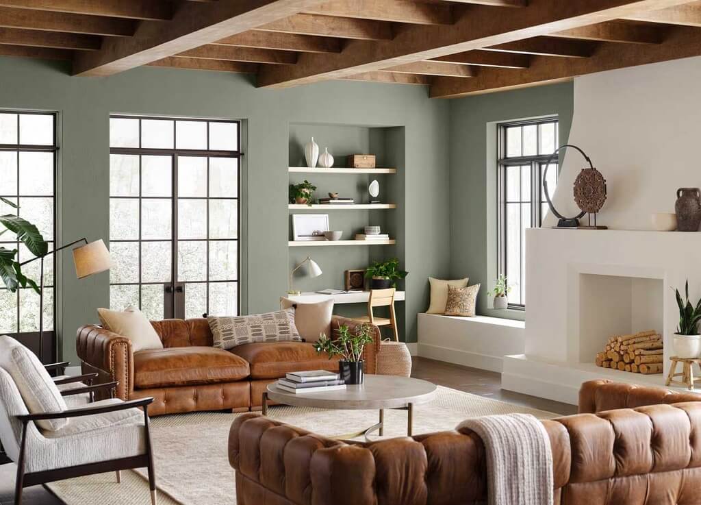
Organic green undertones give Olive Sprig a mid-tone, rich, and enveloping quality. It’s a fantastic paint color for any room in the house.
Olive Sprig was chosen by PPG as their color of the year for 2023. We picked a gray-green tone to reflect regeneration and nature’s resilience as we adjust to new ways of life post-pandemic, evoking images of calming aloe vera plants or velvety sage leaves. Mid-tone hues have a familiar feel, but they’re also adaptable enough to be utilized as a brighter alternative to typical neutrals.
Gentle Olive
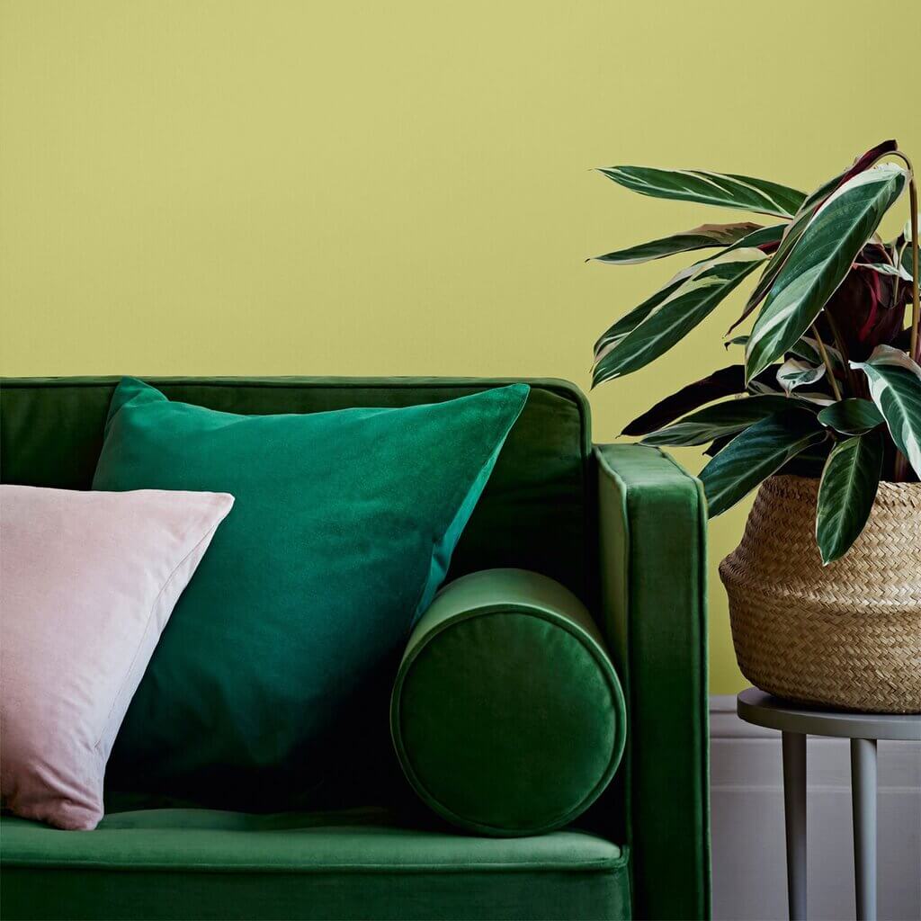
The Minwax color of the year for 2023 is Gentle Olive, a deep green stain. Sophisticated shades of gray and sage bring out the wood’s inherent beauty in furniture like the living room collection from Wazo Furniture, cabinets, shelving, and other furnishings. The calming effects of Gentle Olive may be felt throughout the home, whether it’s in the living room, kitchen, or bedroom.
Our ever-changing habits are captured in Gentle Olive, which evokes a contemplative atmosphere while injecting daily optimism into the house.”
The hue may be paired with peach or pink pastels to create a warm, organic design, while chilly gray or black accents can be used to create a more contemporary look.
Breezeway
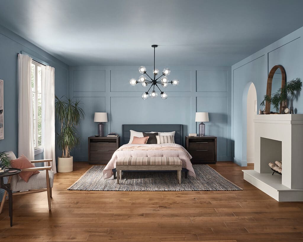
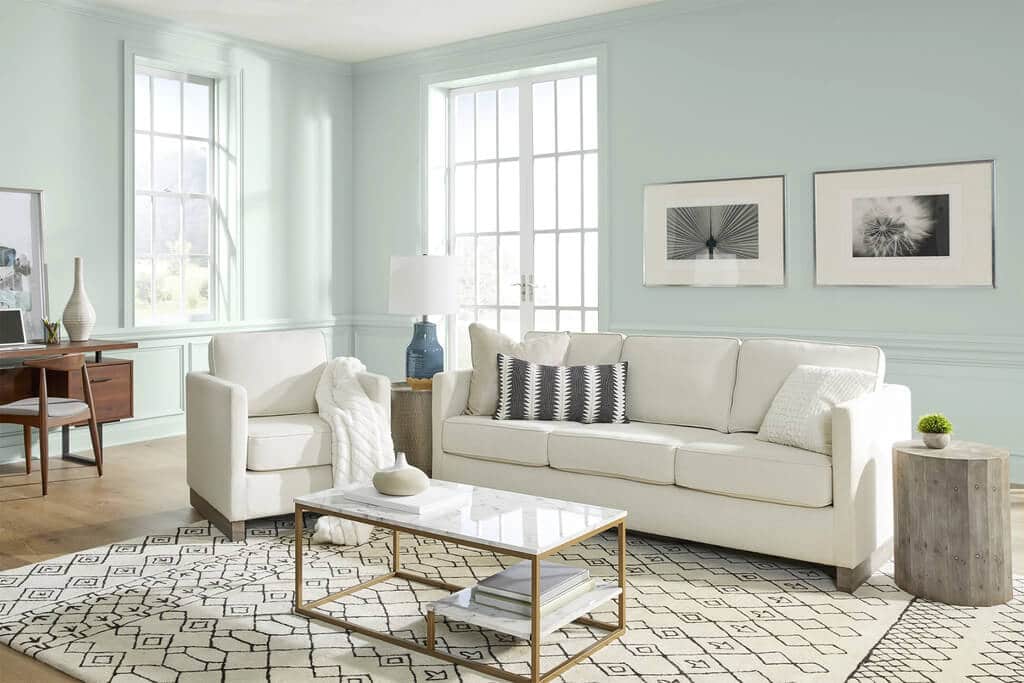
Breezeway MQ3-21 is Behr’s color of the year for 2023, a cool, refreshing green. Silvery blue-green sea glass seen on sandy beaches and in a secluded harbor is the inspiration for this gentle, pastel color palette. As a result of its connection to the natural world, Breezeway evokes a sense of calm, yet its sharp brightness may also generate a sense of excitement and vitality.
White and black elements give Breezeway a crisp contrast and a clean appearance, making it ideal for an entrance or kitchen. Tones of soft cream, warm taupe, and natural woodwork nicely together to create a calming atmosphere that’s perfect for any space where you want to unwind. With a seaside vibe, but also a modern and vintage look, this hue is perfect for any room in your home.
Aleutian
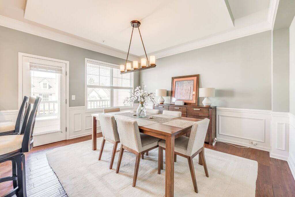
From HGTV Home by Sherwin-Williams, HGSW3355 Aleutian exudes ease and relaxation. The gentle neutrals and subdued earth tones in this palette are intended to make the process of choosing colors for interior design projects as simple as possible.
Off-whites, warm tans, and dusty slates all go nicely with Aleutian. Colors like blue-gray, which have a somewhat warm undertone, are versatile enough to be used in both popular areas like kitchens and living rooms and private areas like bedrooms and baths. Infuse Aleutian’s cozy atmosphere with an abundance of natural wood tones and muted materials.
Satin Rolling Surf
This year’s color of the year for spray paint manufacturer Krylon is Satin Rolling Surf, a vivid turquoise color. The shade, which is described as “optimism, stability, and balance,” represents the contemporary emphasis on well-being and mindfulness. Both inside and out, this bright blue takes its cues from the natural world to instill a feeling of serenity.
When it comes to creating relaxing and rejuvenating environments, Satin Rolling Surf is ideal. Use the hue to give your outdoor furniture a new lease of life, or to add a jewel-tone touch to your home décor.
Guacamole
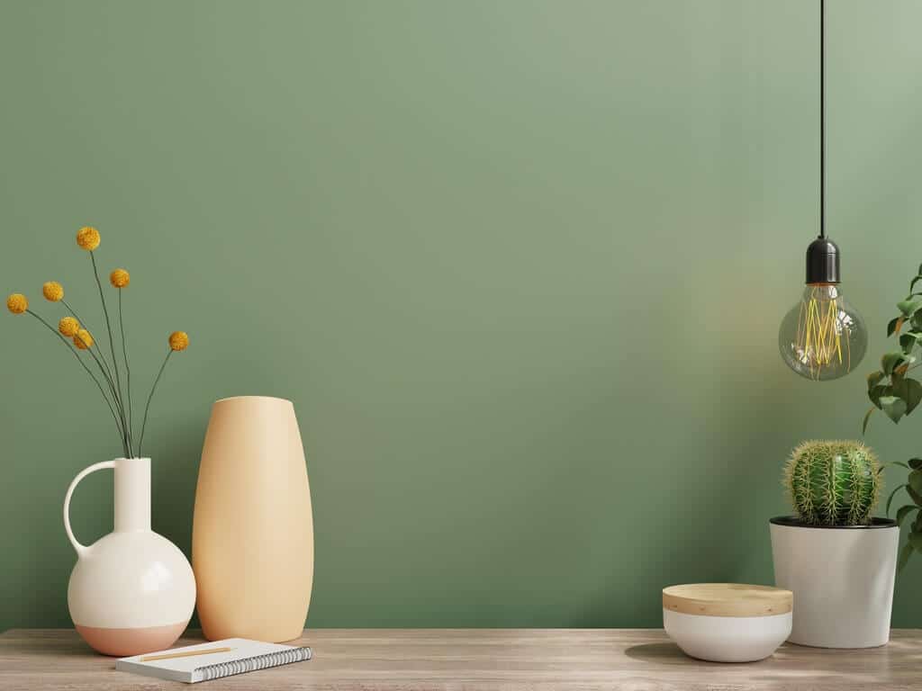
Glidden has chosen Guacamole PPG1121-5 as their color of the year for 2023. A luscious avocado-green tint that’s both calming and refreshing is a crowd-pleaser here. Since 2020, internet searches for green paint colors have more than doubled, showing that homeowners are looking for hues that are soothing, according to a news release.
Guacamole may be used with white subway tile and matte black accessories in kitchens and bathrooms for a timeless combination. Light wood tones and an abundance of plants (real or fake) may help create a peaceful and organic atmosphere in living spaces, home offices, or bedrooms.
Valspar
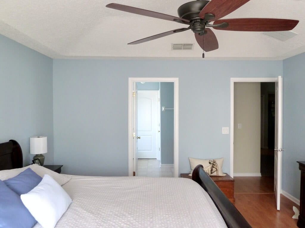
Customers may choose from a variety of naturally derived warm hues in Valspar’s 2023 Colors of the Year, which will not only assist to ease anxieties and enhance mood but also inspire confidence in what the future may bring.
As opposed to picking just one color, Valspar has created a collection of 12 neutrals inspired by nature to express our contemporary need for peace and quiet. Colors for 2023 include warm neutrals, hazy pastels, and calming blues and greens, ranging in intensity from light and mild to dramatic dark. Each color was chosen because of its connection to the natural world and capacity to promote a positive frame of mind.
Using these colors on your walls, cabinets, trim, and more can help you create the atmosphere you want in your house.
October Mist
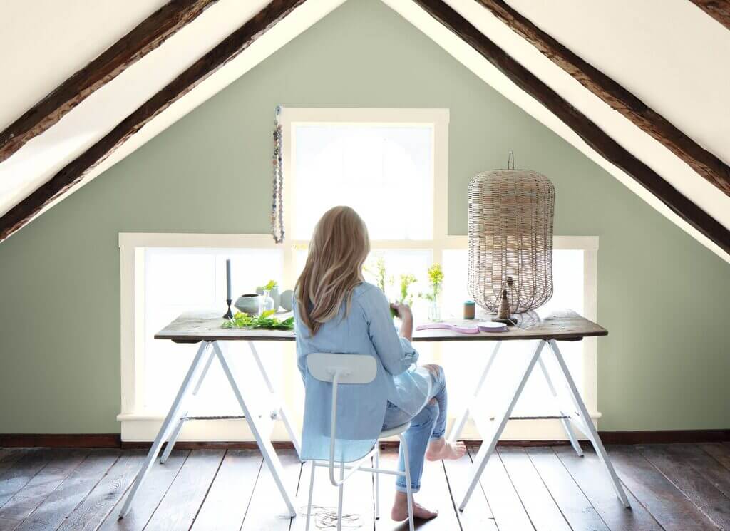
October Mist, a delicate silvery green, is Benjamin Moore’s selection for the 2023 color of the year. October Mist is an excellent neutral with earth tones since it’s the ideal combination of green-gray and soft and chalky.
Based on the delicate green of a flower’s stem, this hue is the starting point for Pantone’s 2023 color trends palette. There are 14 shades in all, ranging from off-white tints to warm earth tones and vibrant primary colors, all inspired by nature.
Evergreen Fog
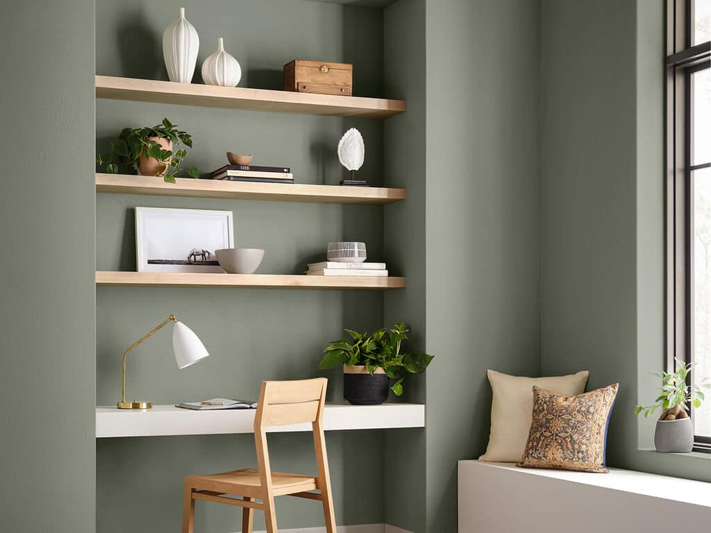
Sherwin-Williams has named their 2023 color of the year Evergreen Fog SW 9130. The chilly neutrals and vivid jewel tones that previously dominated paint color trends have given way to the mid-tone grey-green.
In addition to welcoming visitors, this hue may help produce a sense of calm and relaxation in bedrooms and baths, as well as provide a sense of peace and tranquility to common spaces such as living rooms, kitchens, and dining rooms.
Art and Craft
Nature-based hues with a somber and complex feel characterize Art + Craft’s unique take on classic colors. Art & Craft color is a warm and inviting hue that helps us feel connected to the earth and nature’s seasons, suggesting a time when arts and crafts were a prominent feature of society.
Art & Craft DET682 is a refined brown that evokes the warmth and richness of walnut wood while also instilling a sense of security and stability.
Laurel Leaf
The Better Homes & Gardens collection’s first-ever annual paint color, Laurel Leaf, is exclusively available at Walmart. The hazy green color of eucalyptus leaves indicates a newfound interest in incorporating natural elements into our houses.
Tones such as Laurel Leaf, with their organic undertones and warm undertones, go well with light to medium wood tones and green houseplants.
Keep reading:-

