Outdoor signage has been around for some time because it is easy to implement, and reaches a wide audience. But your outdoor sign has to stand out amid thousands of others that your intended audience will see along the way. So, how do you make your signage attractive, readable and high impact?
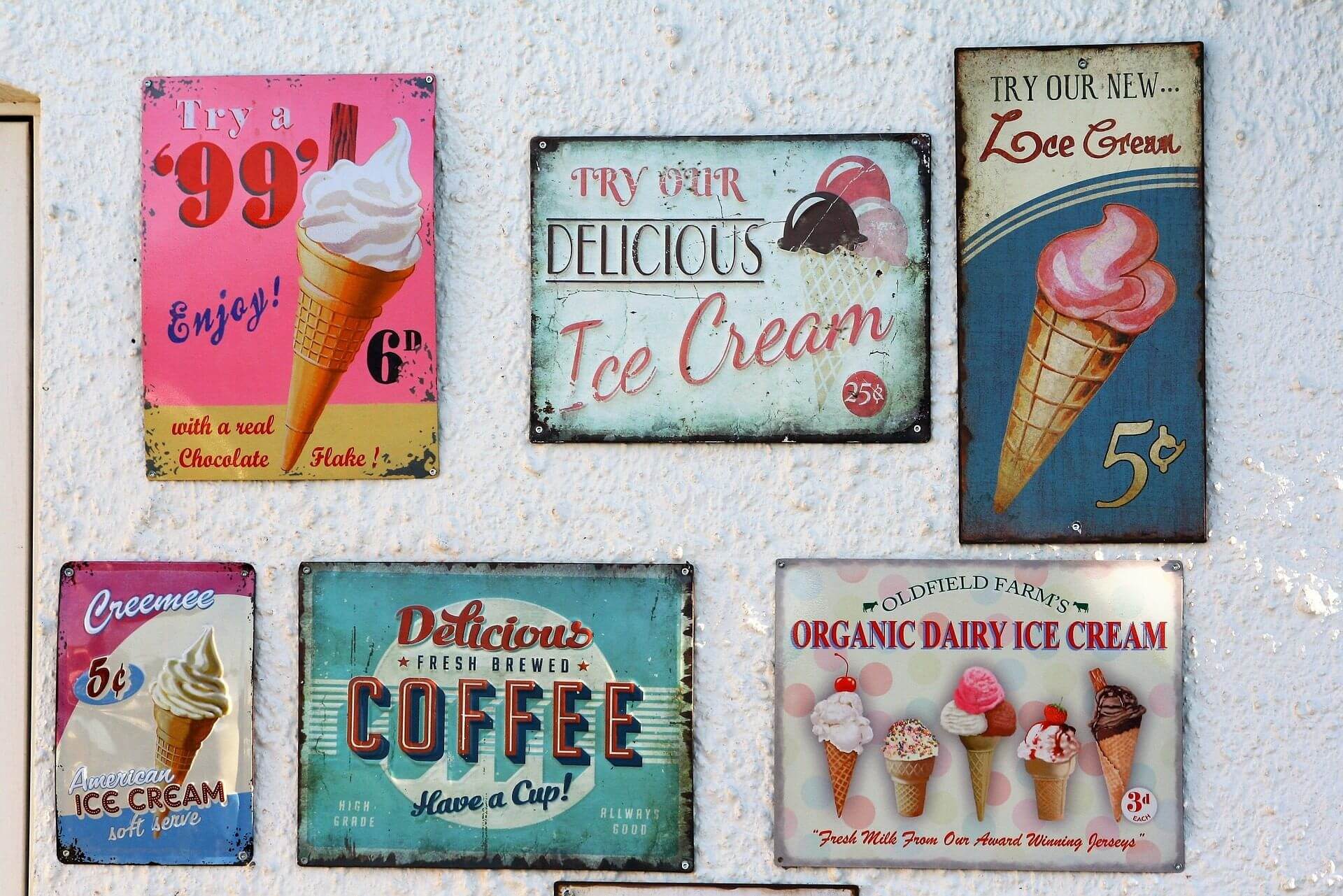
Bright Colors
Understanding the color chart is crucial to know which color works where. Yellow is known as the most visible color to the human eye, while red is the most attractive and powerful color. Incorporating neon colors will make the sign more attractive to teens and children. Avoid pastel colors especially in urban settings because they blend easily and will make your sign invisible.
Font Choices
Many people will notice your signage at approximately 100 feet away, and they should read the font at this distance. It is also important to note that not all people will have perfect vision. Your signage font should be at least 10 inches tall if it is to be viewed by people who are driving. Font size should be at least 3 inches tall if it is intended to be seen by people walking by.
Avoid cursive fonts and those that have serifs at the top and bottom, because they are hard to read from far; the letters can look crowded and blended making it hard to make words apart.
Word Count
Your audience does not have the time to stop and read long sentences or a paragraph, so it is necessary to keep things brief. Keep the word count under 10 words.
Images and Logos
A picture tells a thousand words, and this is very true for signage. Pictures can pass your message much better than words. Remember that pictures and logos can be understood by illiterate people as well. Images with outlines of red scream ‘look at me!’ and are very hard to miss.
Laser Cutting
Laser cutting is relatively new and incorporating it into your signage is likely to it that slight edge over other competing visual objects. Laser-cut images have a depth that gives the image a three-dimensional look, for more info about it visit Signtag.

Spacing and Cluttering
Good spacing makes your signage easy on the eye and easier to process. Avoid cluttering and grouping objects too close together.
Location
Your signage should be easy to spot, but also have a connection to your business when the message is still in the customer’s mind. If you are advertising a new menu, for example, your restaurant should be nearby.
Remember that your audience is seeing thousands of other signs per day, so it is very important to make the above considerations for a sign that works for your brand.
Read more: